Designing the poster and the flyr

I have made a lot of roughs this month. My first idea was to make a manual to explain how to use BEIO. I was thinking of a a twelve pages document. I already had in mind  the way it would look like. But I knew it wasn’t my top priority and each week I was lowering the final version.

rough-1

rough-2

rough-3

This week I had no choice anymore ! I wanted to spend the weekend designing the document. Otherwise, it could be too late to print it. I decided to think precisely about the nature of my document:

  • what is its purpose ?
  • which part(s) of my work does it reflect ?
  • is it something that need to be remembered ?
  • and to whom will I show it ?

I wanted to create a document which graphically expresses my vision of the global concept. A strong, dynamic design, using my graphic elements. But it’s also a communication document that visitors of my booth will bring back. How could I combine the idea of a flyr with text, and a nice object people would like to keep ?

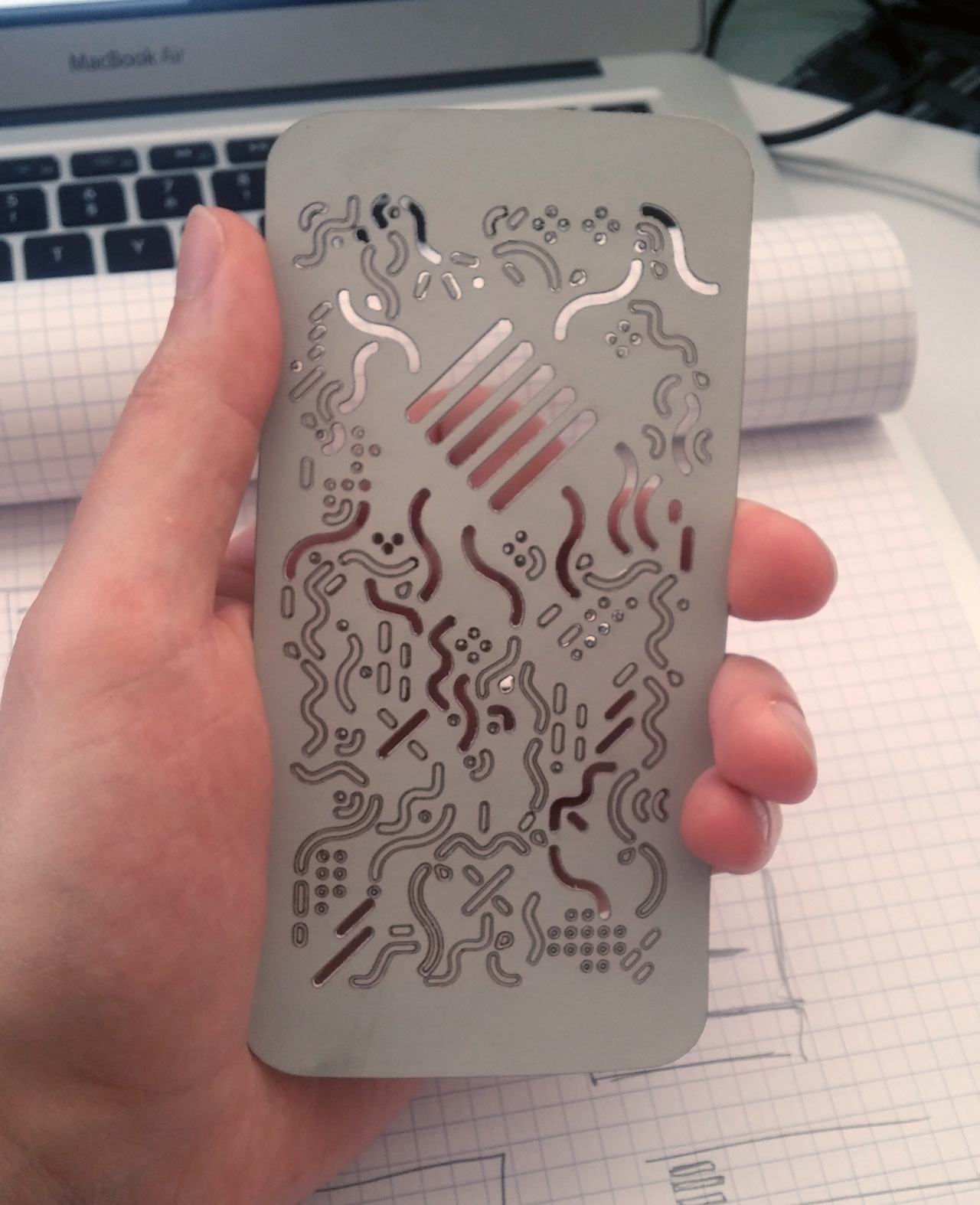
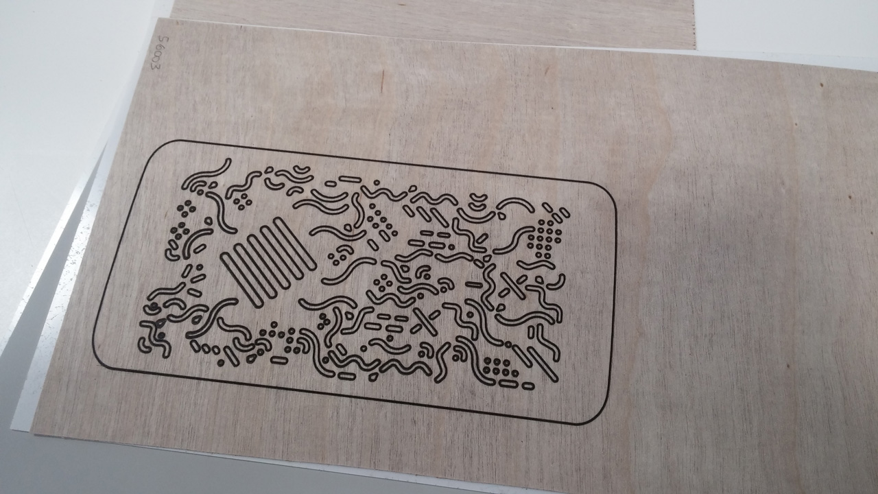
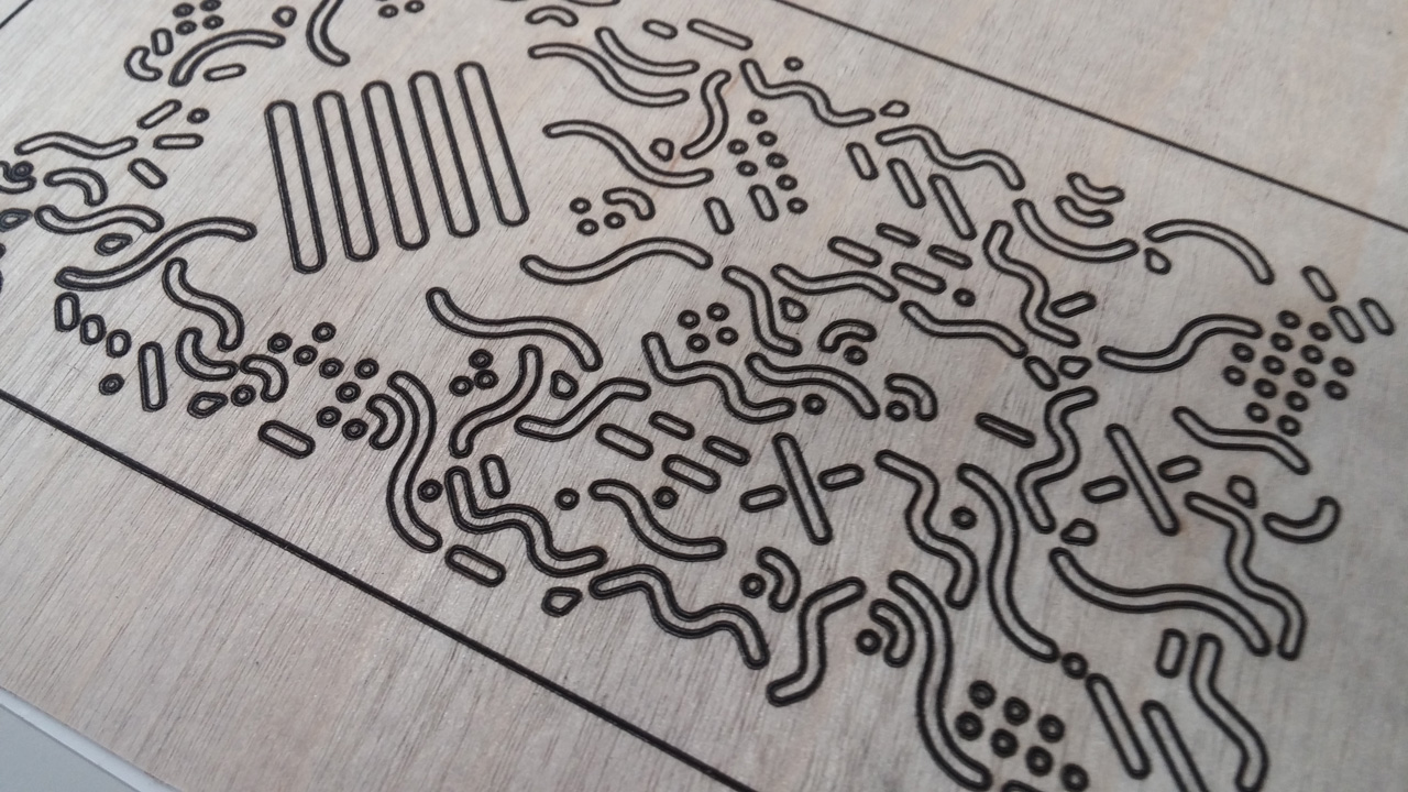
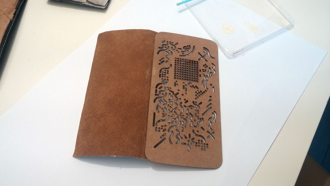
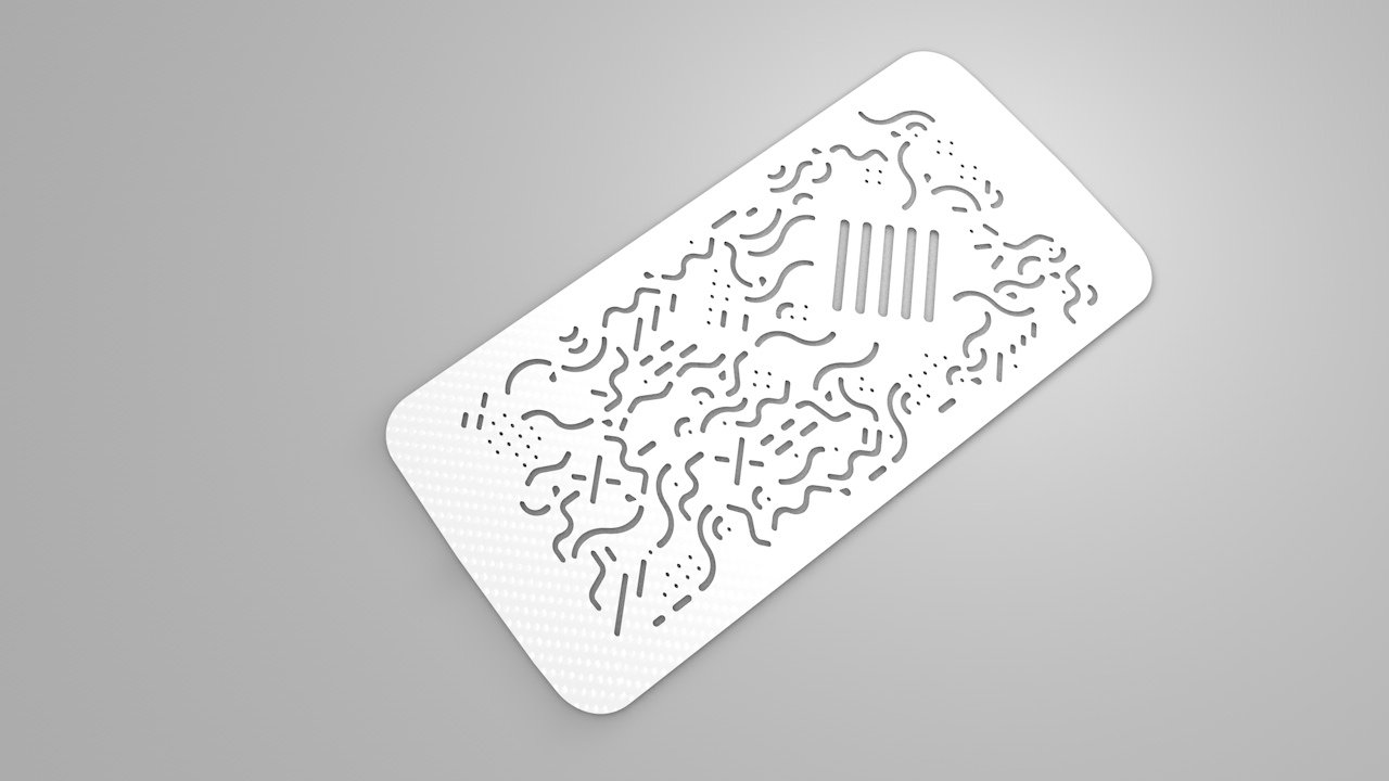
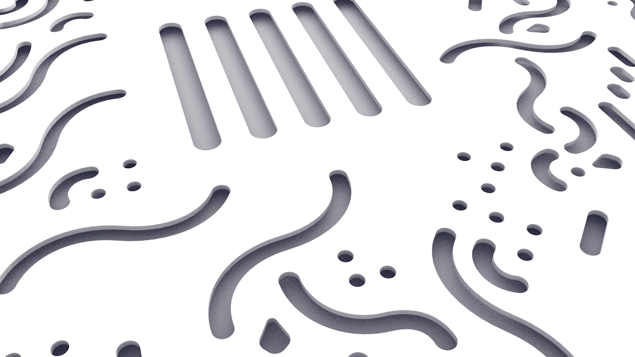
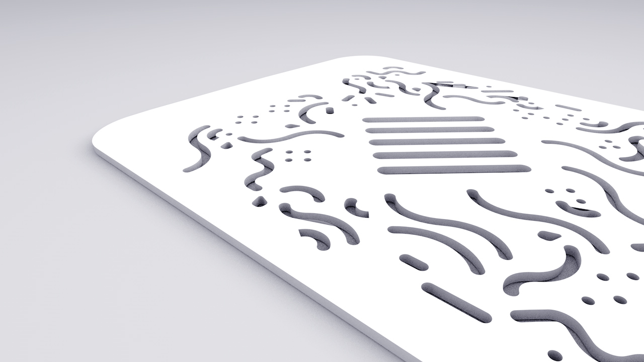
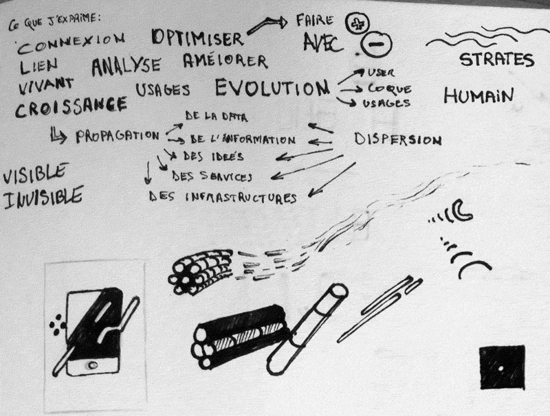
I split this concept in two: I wanted the recto to be the poster, and the verso the flyr. I had quite an idea of how to design the poster that’s why I immediataly decided to think about the flyr. The main idea was to reuse the concept of electronic circuits connecting diffrent parts of a device. So my main text blocks will be linked with my graphic elements. The “bacterias” [as I call them] are spreading on all the surface ! You even need a magnifying glass to see them because sometimes they are very small. The top part of the flyr explains the context, the rest explains my role as a designer, and the punchline of BEIO. The process here is simple: a fast sketch of the main idea, then a higher fidelity one, and then from iterations to iterations…

gif-flyr-2

For the poster I wanted to express the notion of ‘propagation’. I made a fast sketch to explain my analysis of propagation ; it comes from a center, then vectors lead the way [notion of direction]. Time is also a part of the propagation because the relation between distance, direction and speed creates the notion of duration [and velocity]. Finally, it needs a surface/volume ! It grows on something, like lychen on wood and the concept of symbiosis where two elements are linked and interdependant. Here, the smartphone is the surface. Bacterias are growing, eating, but they are also drawing the phone. And without the shape of the phone, bacterias are juste floating in the air… The dynamic is created by flux of bacteria crossing each other. Notice that the angle choosen is the same as the logo.

gif-serigraphy-fwells

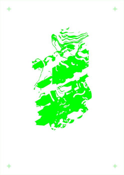
The serigraph printing of the poster will be achieved by studio Fwells in the 13th district of Paris. I asked them to use 3 layers of colours: fluo green, fluo blue, and deep black on a 500g paper. I think the idea of using serigraphy perfectly matches with my concept. As I said, layers are like statums. Using inks with high density on a thick paper make them almost touchables.. The bacterias, the internet, the different phases of creation, use, and recycling.. I think that everything now becomes touchable, and the fluo ink won’t let you look another way. Also, as living things, each printing will be unique, with its own graphic accidents created by the ink and the blending of colors on the edges of the shapes.

Test with new materials

Last friday was a though day… Walked in Paris during almost 5 hours to get different materials like plastic, cardboards, wood and paper to make some tests at Mon Atelier en Ville where Baudouin welcomed me in May to laser cut the prototype 1.0. I wanted to try the white version because a lot of people gave me good comments concerning the 3d renders I created. I went to Antalis, a paper supplier which gives samples. I tooked 5 samples of thick paper. The achieve the white render I wanted to use a smooth paper. First I glued the paper and the plastic. Then I just put it in the machine and let the magic happen. It would have been perfect if the machine wasn’t exhausted of its permanent usage during the day ! The laser almost got through and the render wasn’t perfect. Even Baudouin had some problems to make it work. It was a bad luck day, it happends, but by defining what I really needed, I knew it was just tests. I wanted to do it to try, to tell my users that I thought about this material, and this one, how I could maker the product evolve, etc.

Johanna Hartzheim from Qleek whom I interviewed for my research on tangible interfaces last year gave me tips by mail concenring the wood. So I think that when I’ll be really thinking about the way to produce it [helped by product designers] I will try the wood supplier she told me about.

Light grey soft version. Laser didn't get through all the holes

Light grey soft version. Laser didn’t get through all the holes

Thin wooden version, laser failed here too

Thin wooden version, laser failed here too

Interesting render

Interesting render

A more concrete prototype

On this morning my time was dedicated to the quick prototyping a of more concrete version of my phonecase. It’s really simple but it does the job. I observed that explaining why concept of phonecase without having it attached to the smartphone was causing a little bit of friction.

I created a 3d model and wanted it to be printed but it would take too much time. Thats why I decided to reuse an old broken phonecase I had and to extract just the part I was interested in. I removed the leather part and the magnet. Then I just glued everything to the phonecase cover. used adhesive to stick it to the back of the phone and… magic happening. By covering the adhesive part with my hand I can show it, film it or take pictures without people knowing it looks like this. The magnet also fixes the cover on the screen so when the screen faces the ground, the cover doesn’t fall or act weird. Next week I’ll be printing the new version and test my new animations!


IMG_20150531_120948-blog

The glue need to be carefully cleaned

The glue need to be carefully cleaned

Prototypes and storyboard

Last week I started to think about the video to explain my concept. I don’t consider it as a making of, it will be another video. This video must show my product, which problem it solves, and who needs it. I made videos with my smartphone. I looked for pictures on the internet and then I combined everything in after effects to have a first demo of how I wanted it to look like.

It took me 1h15 to make this video and then I started to iterate on it by listing all the problems. The flow of ideas, the different ways to show the product, everything wasn’t really good but it was ok since it was just a test. Then I took time to write again and re-order my ideas. Then I contacted Yohann Leroy. Yohann is a friend from Lyon, he recently moved to Paris. He is a motion designer and his brother Christopher is a creator and editor. I contacted them because I knew they were doing a great job and I needed their advice and their help for my project.

We met last Sunday. Thanks to the tests I did they had a clear vision of what I wanted to achieve. I explained my project during 2 straight hours and they had a lot of questions. It was super cool to hear people being so interested in my project like this. After drinking a sweet coffe in the 11th district, we split because I needed to go back home fast and work again on the text and the timing of the video.

[su_custom_gallery source=”media: 712,700″ link=”image” width=”300″ height=”170″ title=”never”]

Today I made a new document with more details and I attached images as a storyboard. The video is divided into multiple parts:

  1. Presentation of a persona
  2. Context
  3. Environmental problems
  4. Users problems
  5. Persona’s needs
  6. BE.IO is a solution
  7. Persona learns to use BE.IO
  8. Persona solves its problem
  9. Packshot and details

I sent it to Christopher and I’m waiting for his questions and propositions about the video. By the way you should definitely take a look at his video about his trip to Montreal.

MONTRÉAL : JE ME SOUVIENS. from Christopher LEROY on Vimeo.

3D renders with the new grid

I made fast 3d render using C4D. By exporting your .AI file as an illustrator 3 file you can it merge into a scene and extrude it. It gives me an image of the final result, with multiple angles. I also think that the white render is pretty cool. Maybe this is something I should think about offering to customers [the choice to order the product with multiple colors].


3d-2

3d-3

3d-1