Maker Faire Paris 2015

This weekend I’ll take part in the Maker Faire in Paris. This is the third where I exhibit [after Paris in June 2014 and Roma in September 2014]. I need to quickly create two prototypes. If I’m fast enough I’ll be able to make a wooden phone case and to cut holes with the laser machine from thr WOMA. Otherwise I can also do it with a piece of paper and print the organic shapes I design.

I also want to design at least 3 screens of the app. Best case scenario: they would also be interactive thanks to a prototyping app. It will help me to gather feedbacks from potential users. There will be Fablab [like the WOMA] and professionals I could talk to. They will eventually give me feedback too. My project is then to rework the concept based on the users reactions.

I won’t be the only one from my school to present something. In fact we have a whole booth dedicated to the school. My colleagues will be there too, presenting a project we have been working on since November in addition to our dissertation. The project is called Telemandala. The name is a reference to the project Telegarden created in 1995. This is a collaborative experience through internet where users can create a mandala by controlling two robotic arms. I’ll let you discover this project through the video below.

Service blueprinting

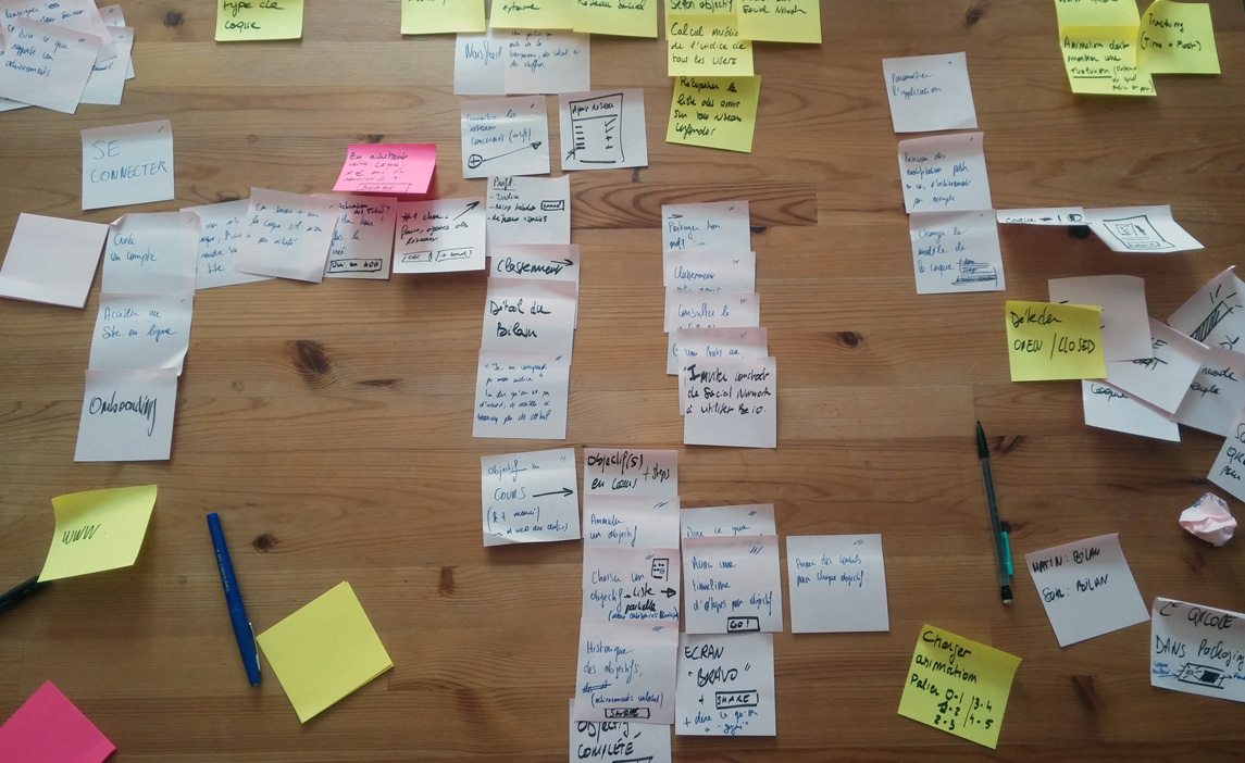
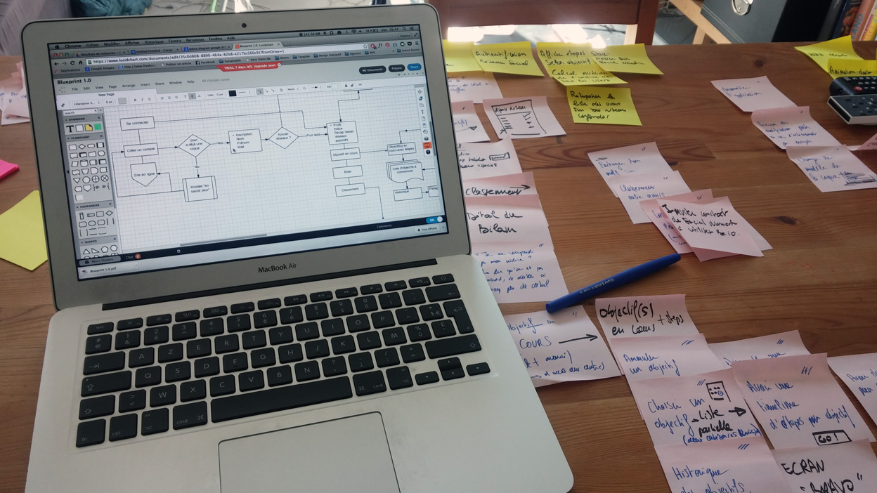
While working on the aspect of the object I also do need to work on the application. I divided intro different parts and followed this process:

  1. Listing all the objectives user can or must achieve on sticky notes
  2. Creating groups of objectives by gathering the notes
  3. With these groups, creating screens or linked screens
  4. Organizing notes to create a user journey
  5. Directly adding notes and rough to add features on the screens
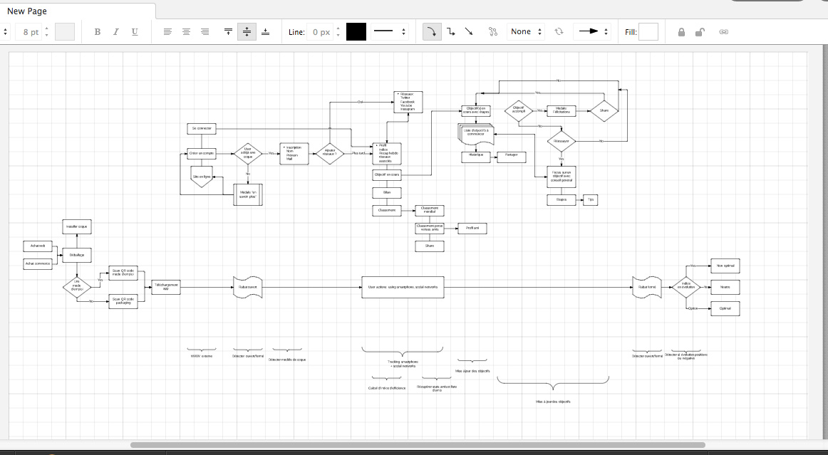
  6. Using Lucidchart to create the user journey [from the purchase to the use of the app] and the technical journey

I consider this as the first prototype of the app. Now I should add more details about the different steps and create a rapid interactive prototype to test the link between screens and if users find it clear.

I'm using sticky notes to make the user journey and list goals.

I’m using sticky notes to make the user journey and list goals.

I use Lucidchart to make it interactive and to share it.

I use Lucidchart to make it interactive and to share it.

Launching of a temporary website

www.be.io.charlesbail.fr

Recently I the idea to create a small platform to explain my project to professionals and teacher [plus my friends & my family]. This website is divided into two main parts:

  • an interactive menu explaining the concept with illustrations
  • a block containing the frequently asked questions

I consider it as a milestone; with all the previous ideations, it’s a way to make the project more concrete and consistent. Some people I met before still had in mind the idea of an old ideation. By creating this simple website and mailing it, I’m proceeding at an update. To me, it’s also a good exercise because I need to be very explicit and have a clear presentation. I realized that I’m often tempted to explain all my thoughts when I only need to explain just a part of it.

I received some good feedback on it. But I guess some things need to be reworked such as the first slide of the presentation. I think is doesn’t show clearly that my concept is a phone case which protects the screen [Jonathan told me to maybe find a better word than “phone case”, it could avoid the confusion]. Also, some people didn’t understand at first that everything was linked to an app. I will rework the illustrations and the text.

The Importance of Shadowing

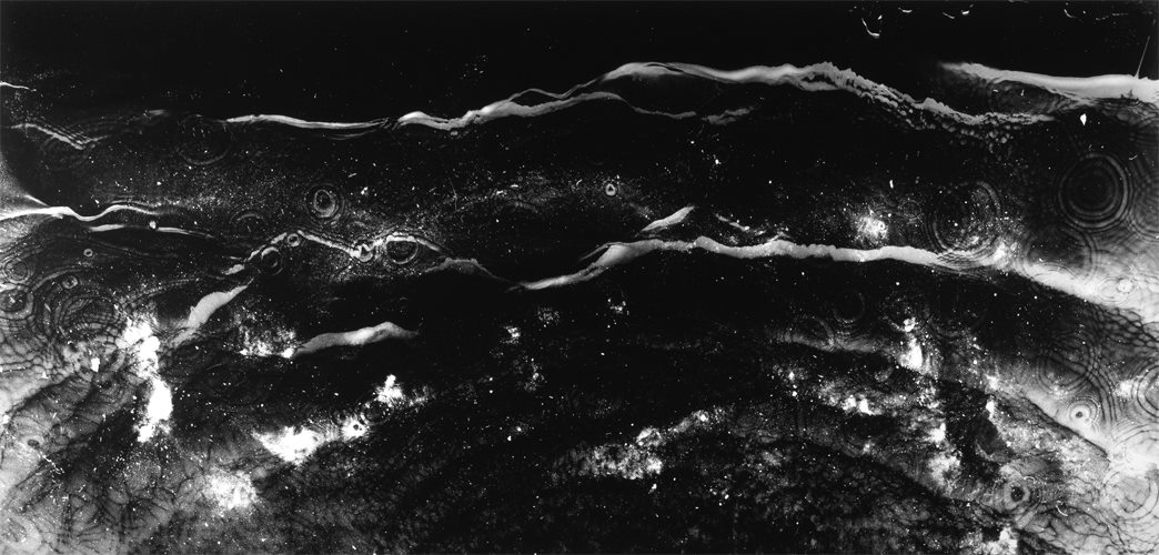
Michael Flomen - Littoral Zone 11

At the end of March I made a survey where I asked several questions about environment, social networks and phone cases. One of my last question was:

Do you consider your phone case as:
a way to express your style?
a way to protect your smartphone?

I was surprised by the answer. 99% of the 80 people who took the survey answered that it was mostly a tool to protect their smartphone. Before, I really thought that it was a way to protect the smartphone but also a way to express our personality (colors, shapes, excentric cases). This made me think of considering the phone case I wanted to create as useful object to protect both the smartphone and the environment.

Recently I decided to pay more attention to the way people use their smartphones in the daily life: at home, in the street, while driving, in the subway, at work. My main motivation was that since I wanted to use the back of the smarthpone I needed to see if it was oftenly covered or hidden.

How are their hands placed arround the phone when they text of when they call someone.
How is their smartphone placed on the table ? Face down or up ?
What part is mostly hidden ?

I will try to briefly explain my reasearches.

First, a lot of people are playing with their smartphone when they have it in their hands. I mean, they are are not playing videogames on it, they are just playing with the real object. Sometimes it falls, sometimes it breaks. When they got a call, 50% to 65% of the back of the smartphone it covered by the hand. When they place their smartphone on the table, it’s usualy for two reasons. The first one is that they don’t want to damage the screen, which seems to be more important than the back. The second one [thanks Jonathan] is that they usually want to check on their notifications while chatting or working. These are constant reminders of their connected life. So they want to be able to tap on the screen, check briefly the title of the notification and go back to their activity if it’s not important.

I think that it would have been kind of a mistake to use the back of the smartphone. I was thinking that it was the most visible part, but I was wrong. Paying attention to people and the object they use everyday helped me to make really important choices for my project. I also found great opportunities ! It gave me the idea to focus on the screen and the phonecase covering the screen. Because this is the most fragile part of the phone for the users. If everything takes place here, then I don’t need to have a connected objects on the back using energy and think hardware. It could be very discrete and less intrusive, and it could just use some battery of the phone by displaying minimalistic informations. Another opportunity is that, by covering the screen or a part of it, I could prevent people from checking on their notifications. Maybe this little friction would make them to constantly be tempted to use their social networks at every time during the day.
Creating shapes

I determined a process to design the phone cases and my visual identity:

  1. create dot grids
  2. graphically express what “bad optimization”, “neutral optimization” and “good optimization” look like
  3. also think in terms of motion design
  4. print it at the size of my screen
  5. try different designs and get feedback from users

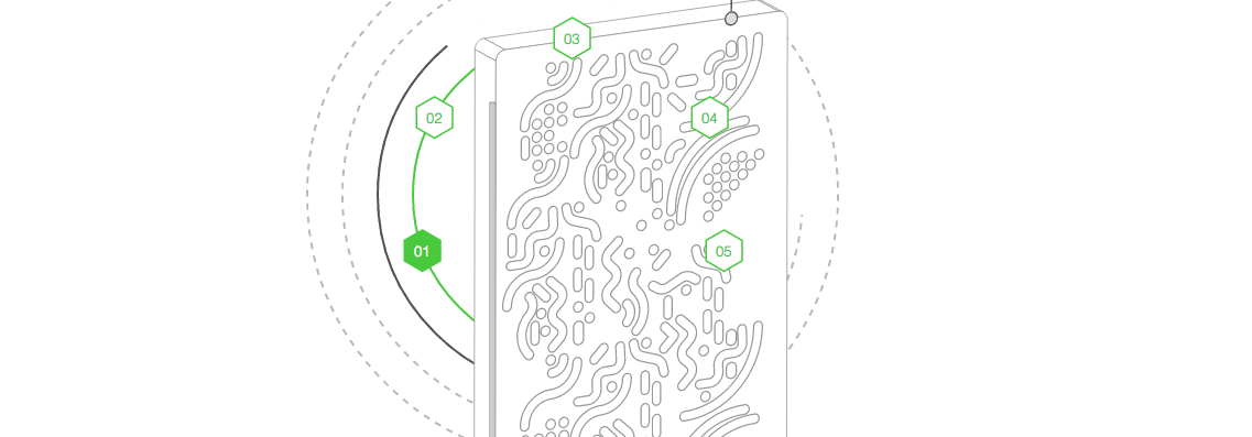
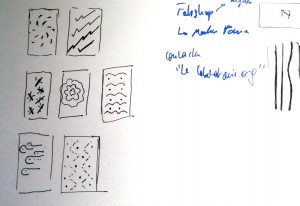
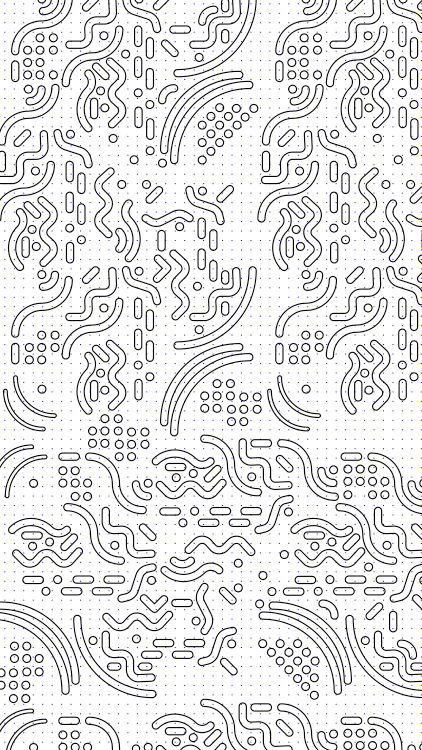
I made some roughs on the paper. I combined them with the idea of good and bad bacterias, the idea of something spreading. It can look lime an organic element, or it can look like the circuits of an electronic components. It can refers to the environment or to the environmental speech I’m trying to spreach.

Then, these shapes have different behaviors and colors, depending on the degree of optimization they refer to. For instance, a vivid red colored shape will express more explicitly a bad optimization.

I also thought about the evolution from the degree of optimization. If someone manages to transform a bad optimiation into a good one, then maybe the vivid elements moving very fast will flourish and slow down. On the contrary, the shapes color can fade.

Rough 1/2

Rough 1/2

Illustrator 2/2

Illustrator 2/2

Rough 2/2

Rough 2/2

Illustrator 1/2

Illustrator 1/2