It’s done

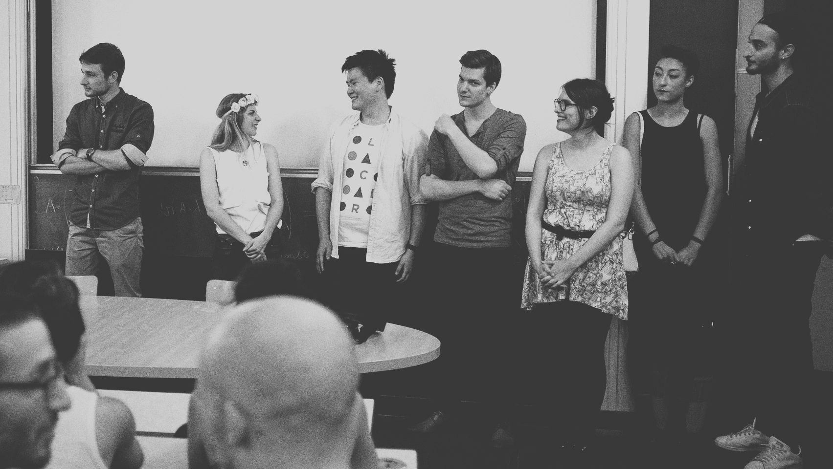
It’s finally done. Nine months of [hard] work. I feel honored to be major of the ’15 promotion with a project linked the environment and the way we live. I had a great feedback from the different juror. They considered it as a very contemporary project which could lead to help solving a problem everybody is not aware of. They also told me that I had a great chance to make it more concrete with the COP21 [Worldwide Conference about Climate taking place in Paris]. The prototype really helped to easily understand the concept. The gamification concept worked well, but a jury told me not to punish the user by making him lose all his seeds [won after successfully reaching an objective].

I feel exhausted, as everyone should after putting all his efforts in a project they believe in. I think my main asset was to believe in what I was doing. When I started working on my dissertation, I remembered that I red an article adressed to students in design. I don’t have the link but I know there was this line, I saved in a document named “golden rule” : “Count on your youth, count on your ability to take risks to solve design problems. Be confident”. I know how I usually react, burying me under work and never stop until I have the solution. But this time I took distance, I did things to evade, and I worked a lot on the way I could ideate. Working a lot in the subway to avoid wasting time. Writing an idea I was proud of, erasing it the next next morning. But I always believed in the context I was working in, and the reflexion I had through my dissertation. Of course I wasn’t able to do it alone, that’s why I say ‘merci’ to my friends, my family, and my teachers for supporting me.

D DAY

These recent days I’m feeling a bit nervous. Or should I say: impatient. The end is near, just some couple of days on my planning to finish everything. This is the period where you need to rely on your last forces because you know you have enough time to finish but you don’t have time to rest: now work and end it !

Designing the poster and the flyr

I have made a lot of roughs this month. My first idea was to make a manual to explain how to use BEIO. I was thinking of a a twelve pages document. I already had in mind  the way it would look like. But I knew it wasn’t my top priority and each week I was lowering the final version.

rough-1

rough-2

rough-3

This week I had no choice anymore ! I wanted to spend the weekend designing the document. Otherwise, it could be too late to print it. I decided to think precisely about the nature of my document:

  • what is its purpose ?
  • which part(s) of my work does it reflect ?
  • is it something that need to be remembered ?
  • and to whom will I show it ?

I wanted to create a document which graphically expresses my vision of the global concept. A strong, dynamic design, using my graphic elements. But it’s also a communication document that visitors of my booth will bring back. How could I combine the idea of a flyr with text, and a nice object people would like to keep ?

I split this concept in two: I wanted the recto to be the poster, and the verso the flyr. I had quite an idea of how to design the poster that’s why I immediataly decided to think about the flyr. The main idea was to reuse the concept of electronic circuits connecting diffrent parts of a device. So my main text blocks will be linked with my graphic elements. The “bacterias” [as I call them] are spreading on all the surface ! You even need a magnifying glass to see them because sometimes they are very small. The top part of the flyr explains the context, the rest explains my role as a designer, and the punchline of BEIO. The process here is simple: a fast sketch of the main idea, then a higher fidelity one, and then from iterations to iterations…

gif-flyr-2

For the poster I wanted to express the notion of ‘propagation’. I made a fast sketch to explain my analysis of propagation ; it comes from a center, then vectors lead the way [notion of direction]. Time is also a part of the propagation because the relation between distance, direction and speed creates the notion of duration [and velocity]. Finally, it needs a surface/volume ! It grows on something, like lychen on wood and the concept of symbiosis where two elements are linked and interdependant. Here, the smartphone is the surface. Bacterias are growing, eating, but they are also drawing the phone. And without the shape of the phone, bacterias are juste floating in the air… The dynamic is created by flux of bacteria crossing each other. Notice that the angle choosen is the same as the logo.

gif-serigraphy-fwells

The serigraph printing of the poster will be achieved by studio Fwells in the 13th district of Paris. I asked them to use 3 layers of colours: fluo green, fluo blue, and deep black on a 500g paper. I think the idea of using serigraphy perfectly matches with my concept. As I said, layers are like statums. Using inks with high density on a thick paper make them almost touchables.. The bacterias, the internet, the different phases of creation, use, and recycling.. I think that everything now becomes touchable, and the fluo ink won’t let you look another way. Also, as living things, each printing will be unique, with its own graphic accidents created by the ink and the blending of colors on the edges of the shapes.

Test with new materials

Last friday was a though day… Walked in Paris during almost 5 hours to get different materials like plastic, cardboards, wood and paper to make some tests at Mon Atelier en Ville where Baudouin welcomed me in May to laser cut the prototype 1.0. I wanted to try the white version because a lot of people gave me good comments concerning the 3d renders I created. I went to Antalis, a paper supplier which gives samples. I tooked 5 samples of thick paper. The achieve the white render I wanted to use a smooth paper. First I glued the paper and the plastic. Then I just put it in the machine and let the magic happen. It would have been perfect if the machine wasn’t exhausted of its permanent usage during the day ! The laser almost got through and the render wasn’t perfect. Even Baudouin had some problems to make it work. It was a bad luck day, it happends, but by defining what I really needed, I knew it was just tests. I wanted to do it to try, to tell my users that I thought about this material, and this one, how I could maker the product evolve, etc.

Johanna Hartzheim from Qleek whom I interviewed for my research on tangible interfaces last year gave me tips by mail concenring the wood. So I think that when I’ll be really thinking about the way to produce it [helped by product designers] I will try the wood supplier she told me about.

Light grey soft version. Laser didn't get through all the holes

Light grey soft version. Laser didn’t get through all the holes

Thin wooden version, laser failed here too

Thin wooden version, laser failed here too

Interesting render

Interesting render