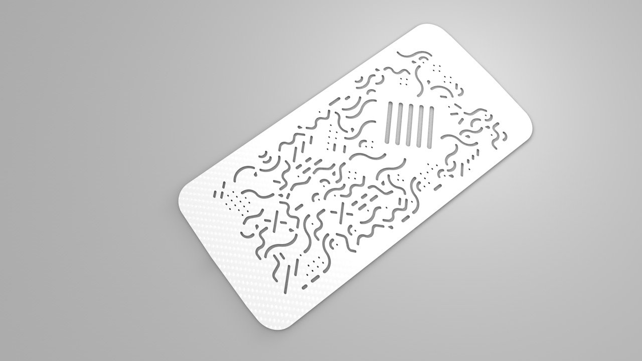
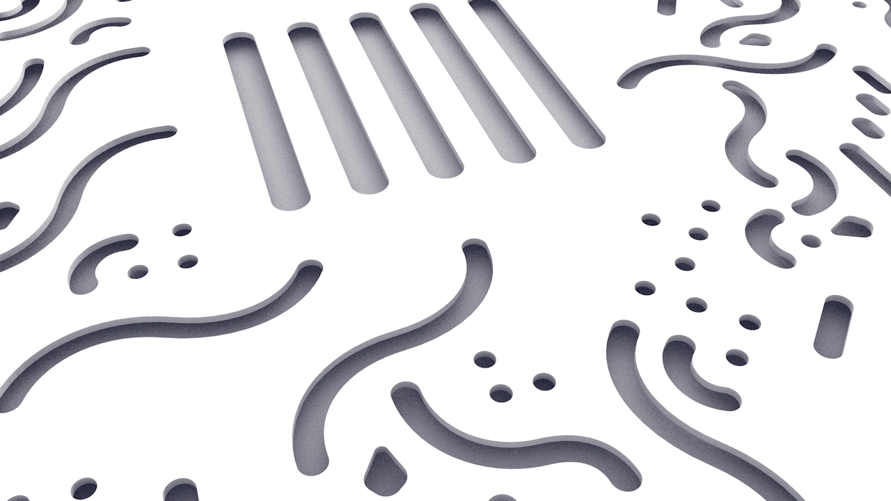
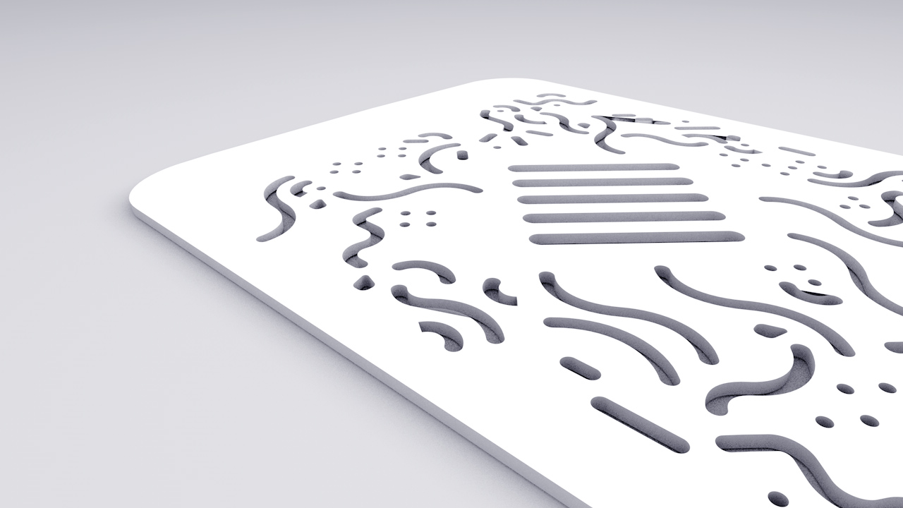
I made fast 3d render using C4D. By exporting your .AI file as an illustrator 3 file you can it merge into a scene and extrude it. It gives me an image of the final result, with multiple angles. I also think that the white render is pretty cool. Maybe this is something I should think about offering to customers [the choice to order the product with multiple colors].


As I said recently I was working on a new design for the grid, with more meaning. Alexandre Rivaux give me some tips to set up my grid. I decided to align perfectly the multiple elements. But sometimes, I decided to make optical corrections, making each part of the phone case unique.
[su_custom_gallery source=”media: 707,708,709″ link=”image” width=”300″ height=”170″ title=”never”]
My phonecover already embodies the concept by its aspect. What I think I want to achieve is a modular identity. The aim is to have some basic elements and to create more interesting shapes by combining them. It works well with the idea of doing more with less, a principe of efficiency.
My keywords are:
Connection / Optimism / Optimize / Link / Analysis / Propagation / Evolution / Human / Invisible

First logo & texture

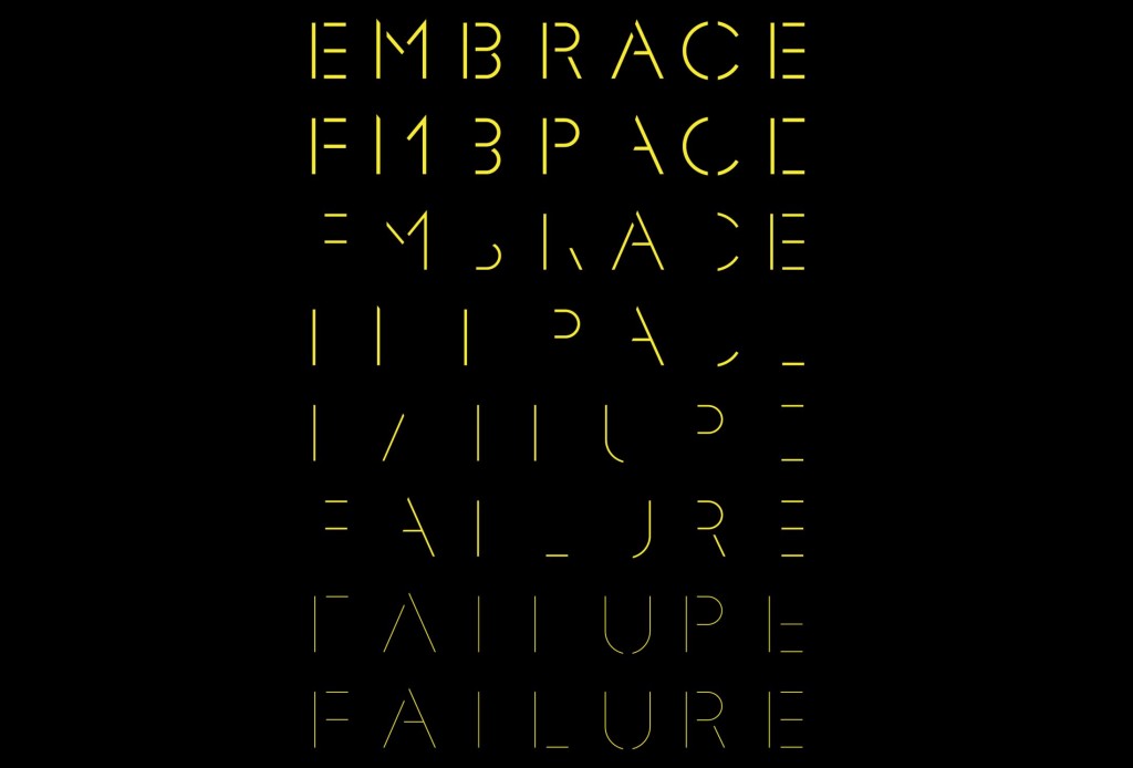
Second attempt with stencil font
I had the feeling that it was too abstract for someone who never heard the name BE.IO . Jonathan has the same feeling and told me that it would haver force me to write the name of the product next to the logo, and it’s not a good choice. He gave me a great typographic reference: a stencil font. More precisely he told me to take a loot at the recently designed F37 Glaser Stencil. This is the digital version with thiner weights.

Follow Charles’s board Moodboard tech on Pinterest. Follow Charles’s board Propagation on Pinterest.

I spent two days at school with Félicie to improve my project. Her main concern was the meaning of the shapes on the phonecase. Fact is she was right since I randomly drew them in order to do a fast prototype. My initial aim was to graphically express an index of optimization. But it’s easier to explain when you have a meaningful, powerful and understandable metaphore that everyone gets.

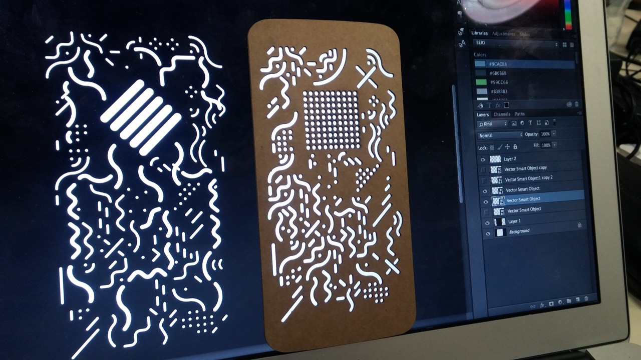
New prototype on the left, old one on the right
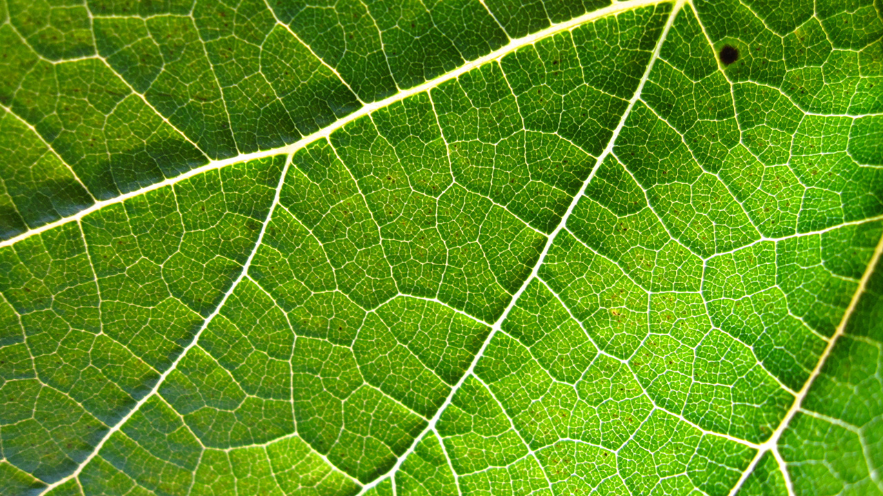
The new design now integrates a gauge divided in 5 elements instead of a precise display. It also reduces the idea of a mark delivered by the app that could create too much friction for the user being judged. Again, I’m mixing the idea of a microprocessor and a leaf. A microprocessor delivers its energy to the different components of a device. The veins of the leaf does the same and starts from a main vein then divide into the secondary veins, etc. Now the energy ‘saved’ by the app is stocked in the gauges then it’s realeased in 5 main streams. The more energy you saved [better the index] the farthest it will go.


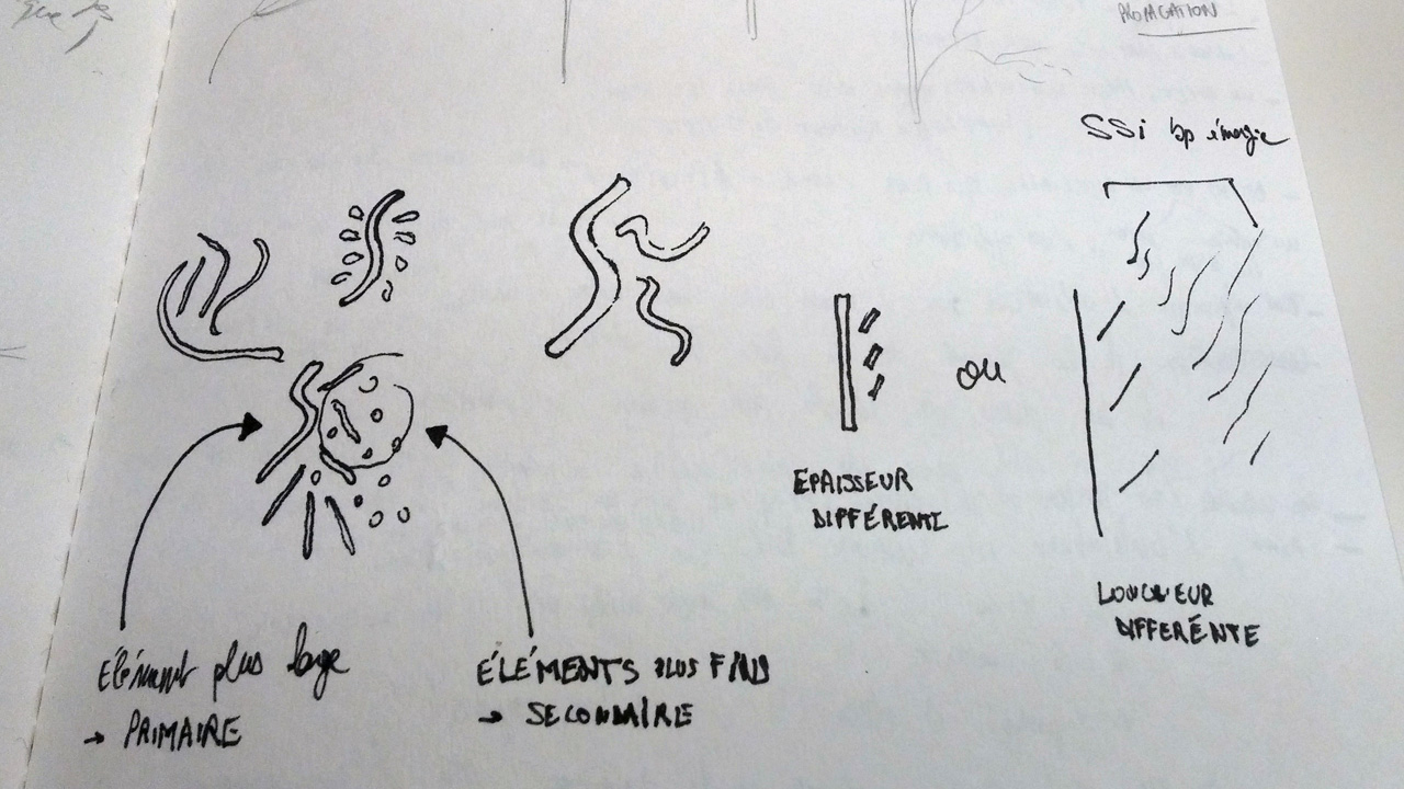
The book To a Natural Design [Vers un design naturel] written by Mohammed Bennani helped me to understand the concept of natural patterns, which are presents in the leafs for example. Some shaped can be very organic, going to different directions, with different weights. But if you repeat them with a pattern it instantly becomes organized.
I’m writing new articles and selecting visuals to show. Meanwhile, here is a prototype of the animation I’m working on.
