My phonecover already embodies the concept by its aspect. What I think I want to achieve is a modular identity. The aim is to have some basic elements and to create more interesting shapes by combining them. It works well with the idea of doing more with less, a principe of efficiency.
My keywords are:
Connection / Optimism / Optimize / Link / Analysis / Propagation / Evolution / Human / Invisible
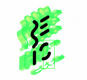
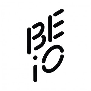
First logo & texture
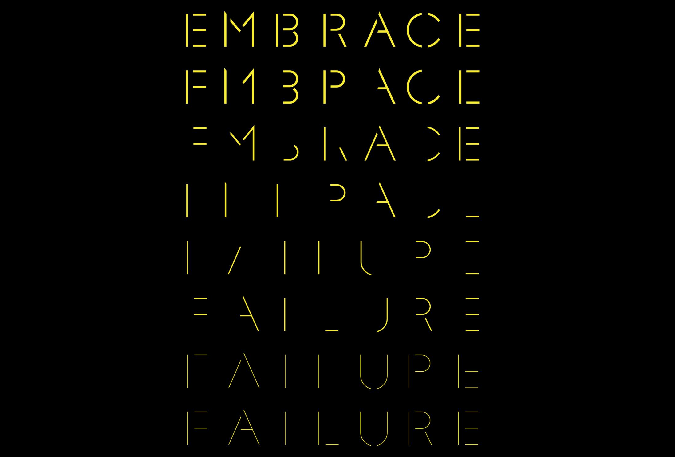
Second attempt with stencil font
I had the feeling that it was too abstract for someone who never heard the name BE.IO . Jonathan has the same feeling and told me that it would haver force me to write the name of the product next to the logo, and it’s not a good choice. He gave me a great typographic reference: a stencil font. More precisely he told me to take a loot at the recently designed F37 Glaser Stencil. This is the digital version with thiner weights.
Follow Charles’s board Moodboard tech on Pinterest. Follow Charles’s board Propagation on Pinterest.