Interview of Christophe Clouzeau

Recently I made three interviews. This helps me to learn more about precise notions of my work but also to test if my insights could be right. I met Christophe Clouzeau, UX designer and director of Neoma agency in Paris. He has a side project called http://webdeveloppementdurable.com, a website which aims are to inform and create thinking about our behaviour towards digital medias.

The complete interview will be soon translated in english.

Two main axis to think sustainable design

Illustration of sustainable design

Mankoff offer a now widely adopted categorization of sustainable HCI into two orientations: SUSTAINABILITY IN DESIGN (mitigating material effects of software/hardware), and SUSTAINABILITY THROUGH DESIGN (influencing sustainable lifestyles or decision-making). Mankoff, Kravets and Blevis identify ways computer scientists can help reduce energy usage: by reducing computers’ energy consumption and electronic waste through, for example, control systems or educational applications, and by supporting climate data collection and science.

CHI 2010: Mapping the Landscape of Sustainable HCI April 10–15, 2010
Carl DiSalvo, Phoebe Sengers, Hrönn Brynjarsdóttir

Just watched Objectified by Gary Hustwit

I just watched Objectif by Gary Hustwit who is the author of 3 main documentary films:

What I like in Objectified is the fact that we see a lot people who contribute to make a product. But this is not just as creating the physical shape, we must create a system and a scenario.
 

You’ll never look at your next toothbrush (or your next any product) in quite the same way after watching this astute, elegant inquiry into the purpose and process of industria
— ENTERTAINMENT WEEKLY

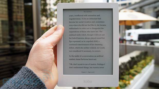
A Kobo to help

Recently I remembered how hard it was to read on a desktop screen because I had a lot of different articles –mostly .pdf files– which were really long, written in two-columns. Furthermore I needed to highlight parts of text, write annotations. I usually do it on paper but here the task was much more difficult. Finally, it isn’t easy to do in the subway.

First I tried to use some google chrome plugins to help me to do this. Some were buggy, laggy. Why is it so difficult to achieve something that’s easy when done on paper. I decided to buy a Kobo, to solve my problem of printing and comfort. Synced with the Pocket service I have a library with the articles I want to read and I can have a clear timeline of what I achieved. It feels more comfortables and it drives me to read (a lot). Also the highlighting feature is fast and intuitive.

Later on I found an interesting article about the sustainable web “Save the planet through sustainable web design”. I didn’t want to print articles on paper, because to me something virtual consumes less energy and ressources than a physical object. But what if in some cases virtual is less greener than physical ?
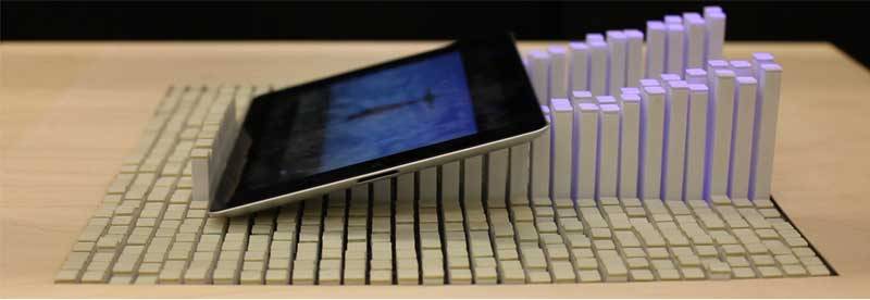
MIT - Inform projectDisplay data = dots on screen = light = ressources.
Refering to the “coupling bits & atoms” theory by Hiroshi Ishii from the MIT Lab.

And this is more than screen = electricity. Because it means that by controlling the data and the way it’s displayed, designers can affect the amount of consumed energy. This article made me realize that there can be a sustainable webdesign.

In my case, I think I was right because I use a Kobo with the Ink Screen technology.