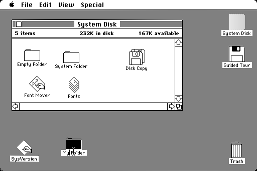
Energy consumption increases when the user stays on he webpage, or goes through too much webpages, backward, forward. It’s in the user’s and the brand’s interest to have a good UX. When the first computers were introduced for personal use, it was the introduction of the desktop metaphor as it was considered as a workspace (It needed papers, folders, a trash bin, etc.). It was needed because it was a new technology people were not familiar. To make them more confident and help then to understand the interface they were using, they used this metaphor.
Desktop Metaphor
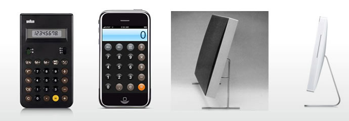
When Apple introduced the iPhone, it was a whole new object. Exactly as the desktop metaphor, they used what’s called skeuomorphism. Attached to notion of affordance, it leads user to discover the mechanism of the interface by recreating the apparences of the objects. For example for a calculator, your would be actually using a “realist simulation” of a calculator with round buttons, animations when they are pressed etc.
Then, years later when the users were familiar with this interface, it made room for flat design which is more abstract and “content first”.
Here are some references about Braun design and it which ways it influenced Apple (for object design and interface design)