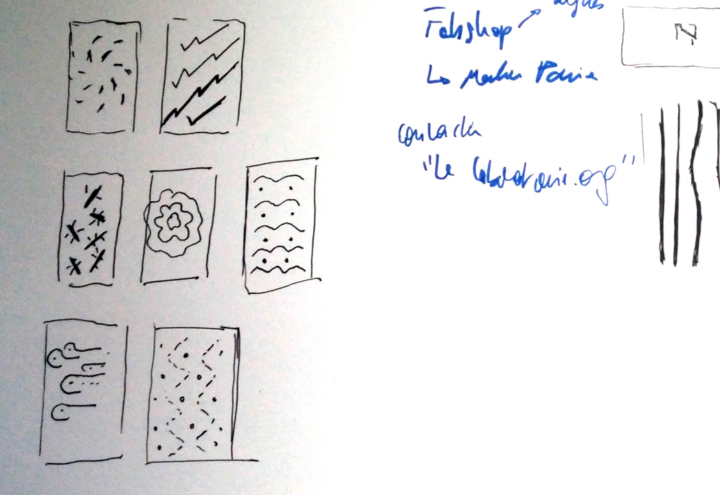
I determined a process to design the phone cases and my visual identity:
- create dot grids
- graphically express what “bad optimization”, “neutral optimization” and “good optimization” look like
- also think in terms of motion design
- print it at the size of my screen
- try different designs and get feedback from users
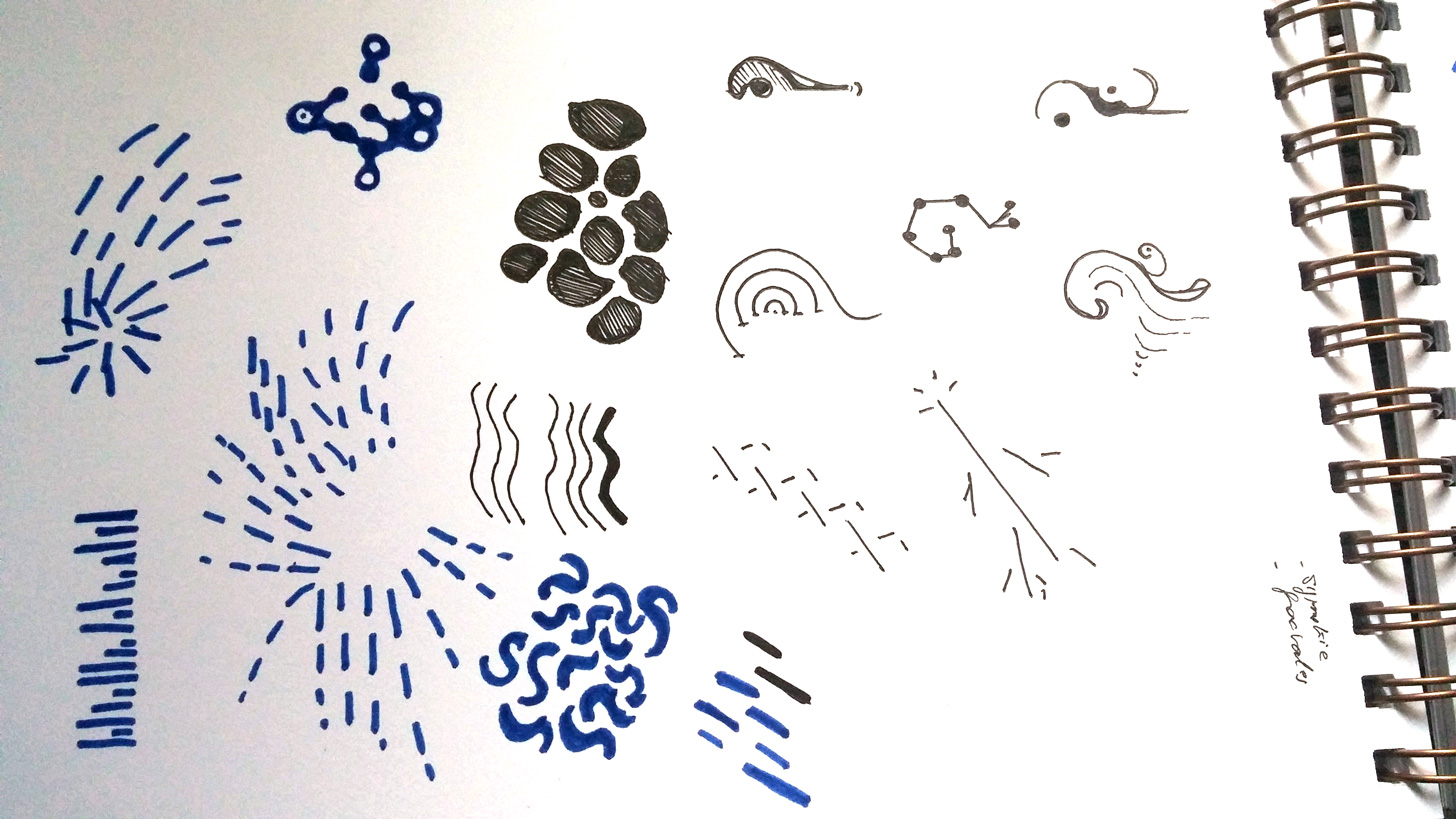
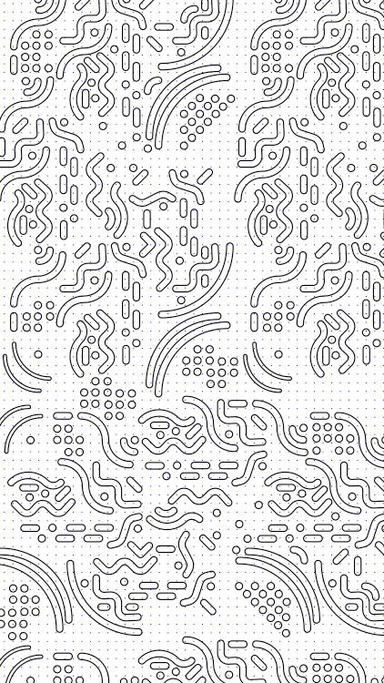
I made some roughs on the paper. I combined them with the idea of good and bad bacterias, the idea of something spreading. It can look lime an organic element, or it can look like the circuits of an electronic components. It can refers to the environment or to the environmental speech I’m trying to spreach.
Then, these shapes have different behaviors and colors, depending on the degree of optimization they refer to. For instance, a vivid red colored shape will express more explicitly a bad optimization.
I also thought about the evolution from the degree of optimization. If someone manages to transform a bad optimiation into a good one, then maybe the vivid elements moving very fast will flourish and slow down. On the contrary, the shapes color can fade.
Rough 1/2
Illustrator 2/2

Rough 2/2
Illustrator 1/2